After nearly a month of development, we’re happy to announce the implementation of a number of features outlined in the the previous post!
An overview of what’s been created so far:
User Interface / Interactivity
UI Development
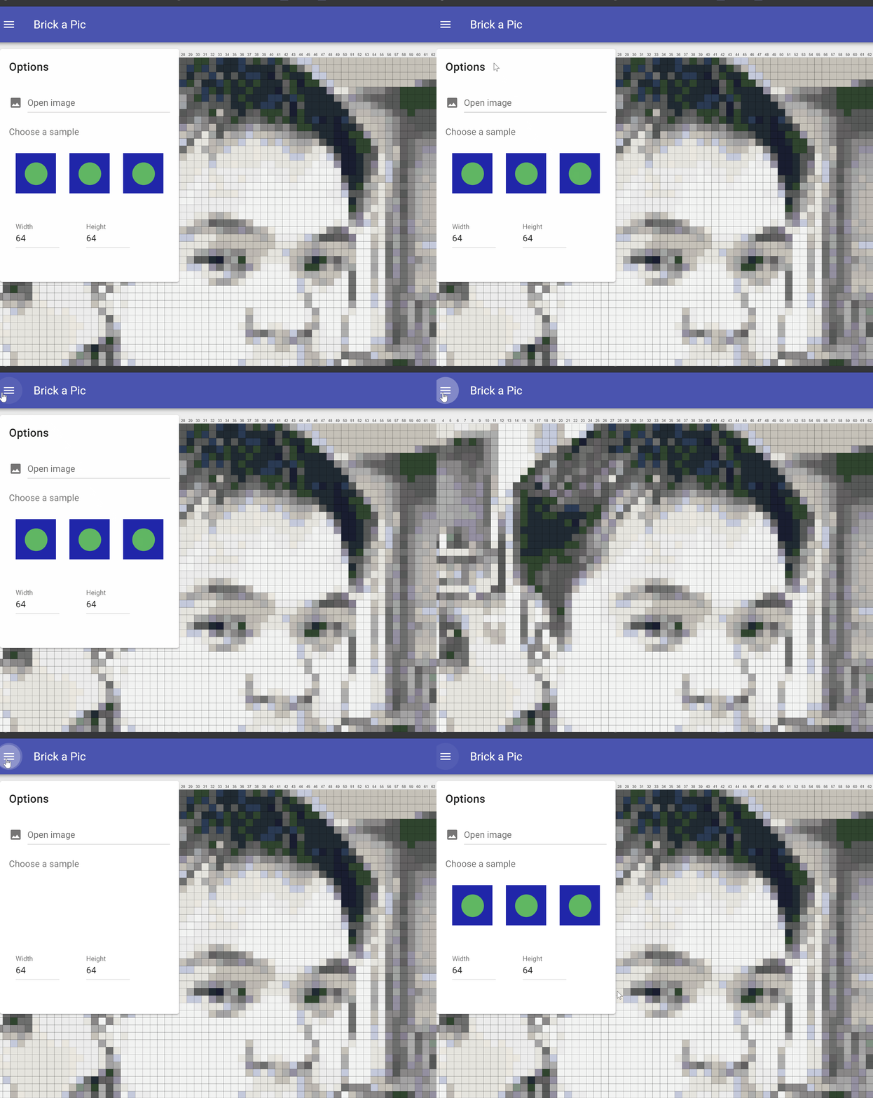
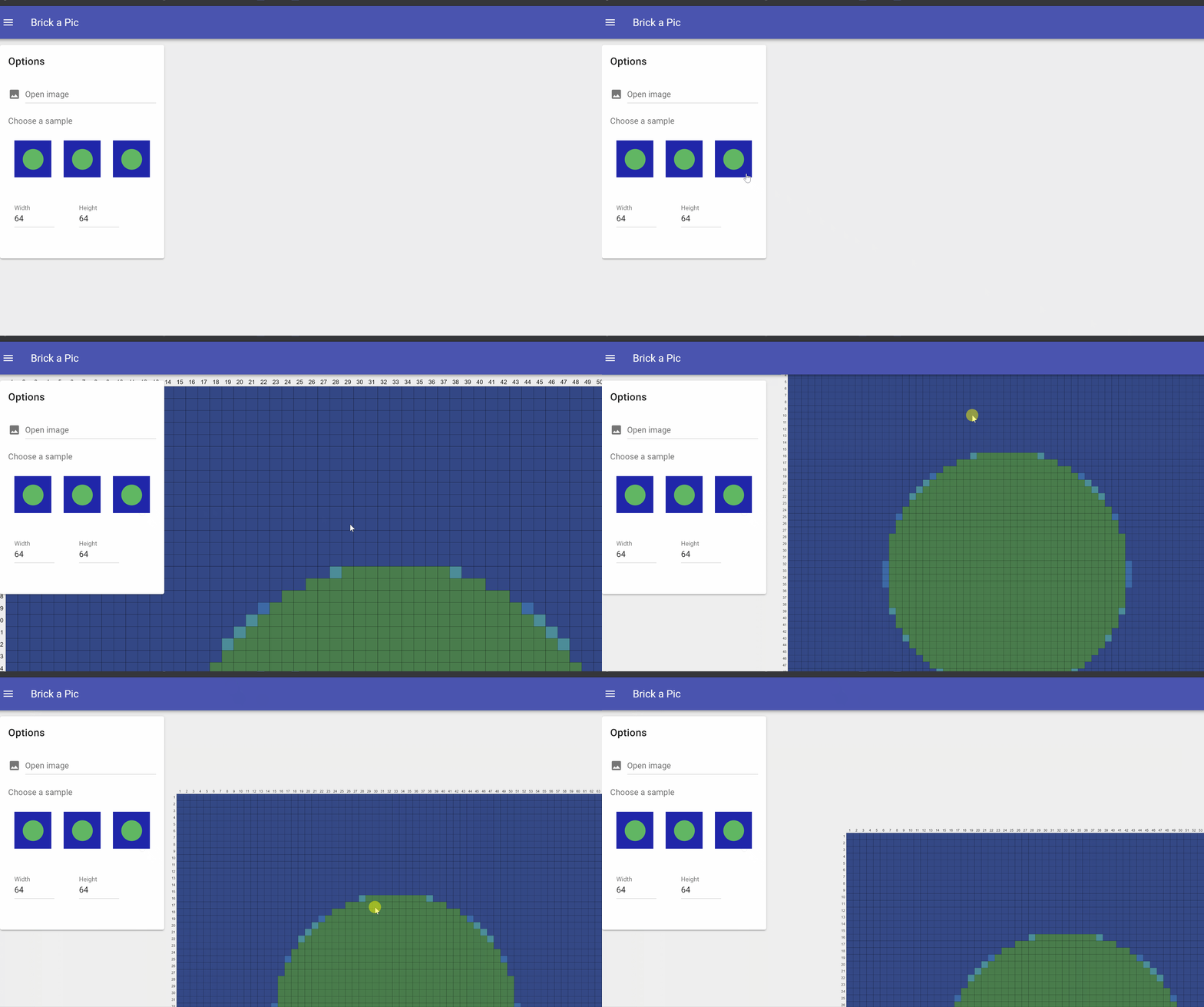
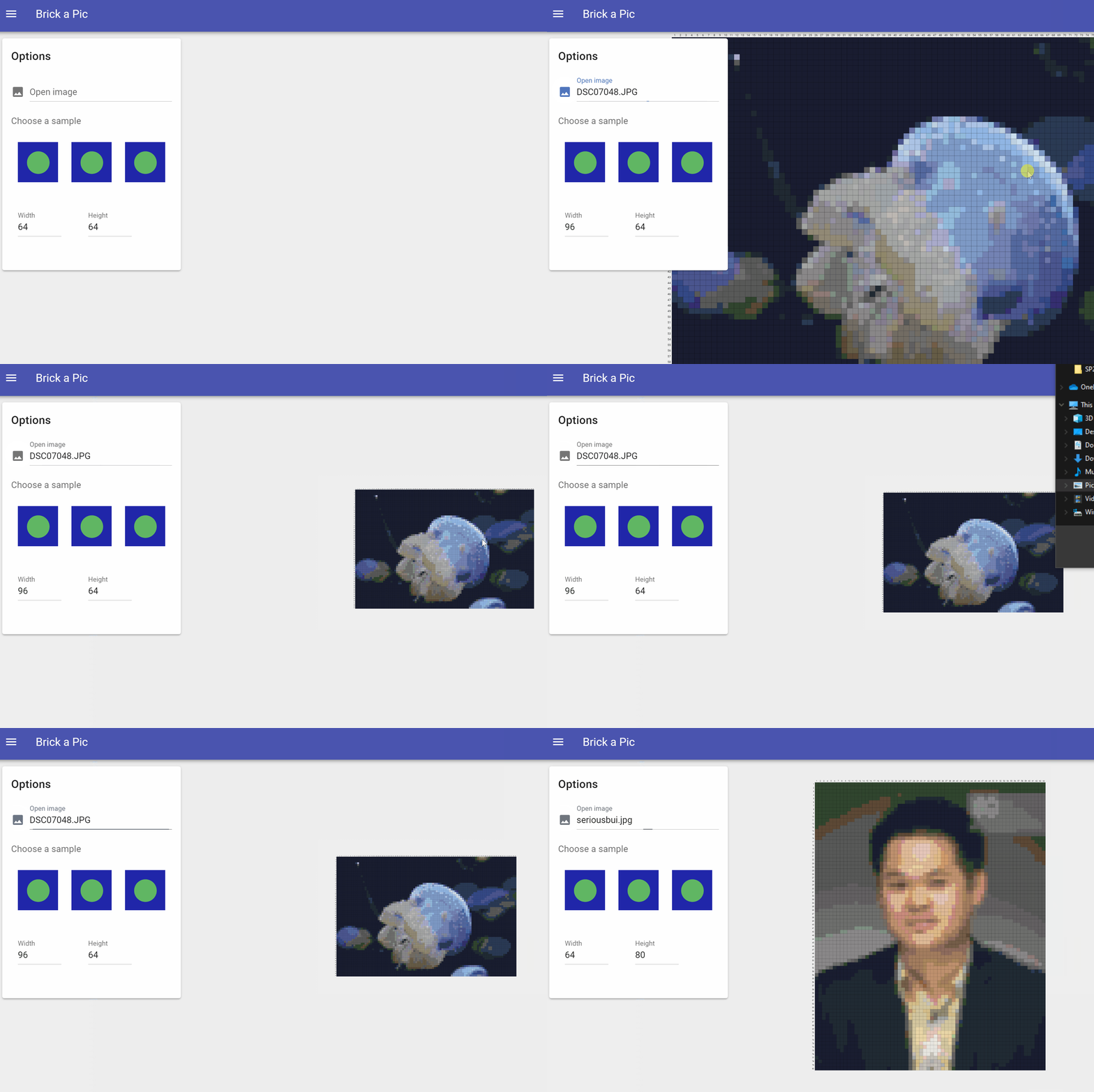
We’ve decided to create our UI using Material Design components from Vuetify, a component framework for Vue. It’s enabled us to quickly make a simple, repsonsive user interface:
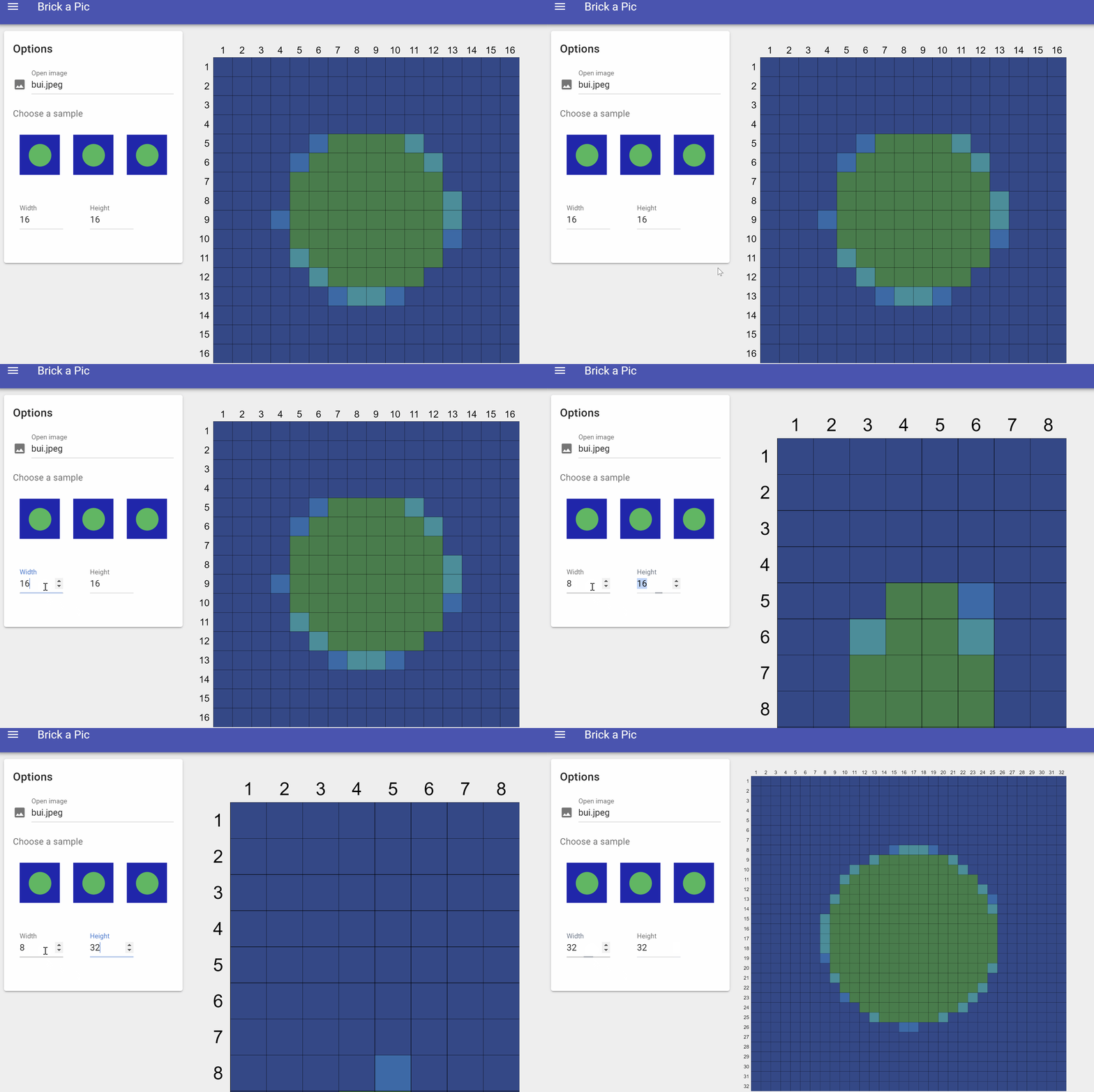
The dimensions of the resulting mosaic can be adjusted in the settings:
And the resulting image will have gridlines and grid numbering to guide builders:
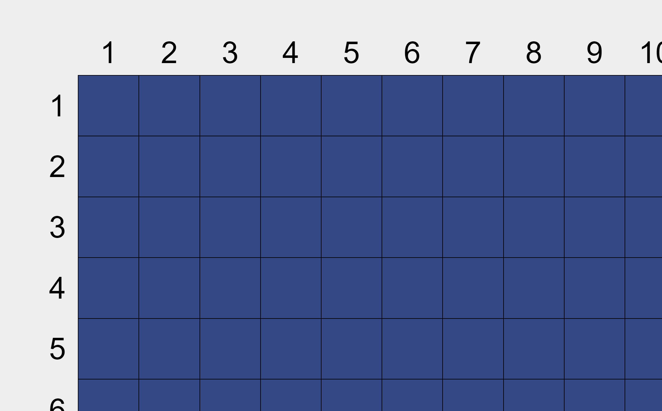
Image Upload
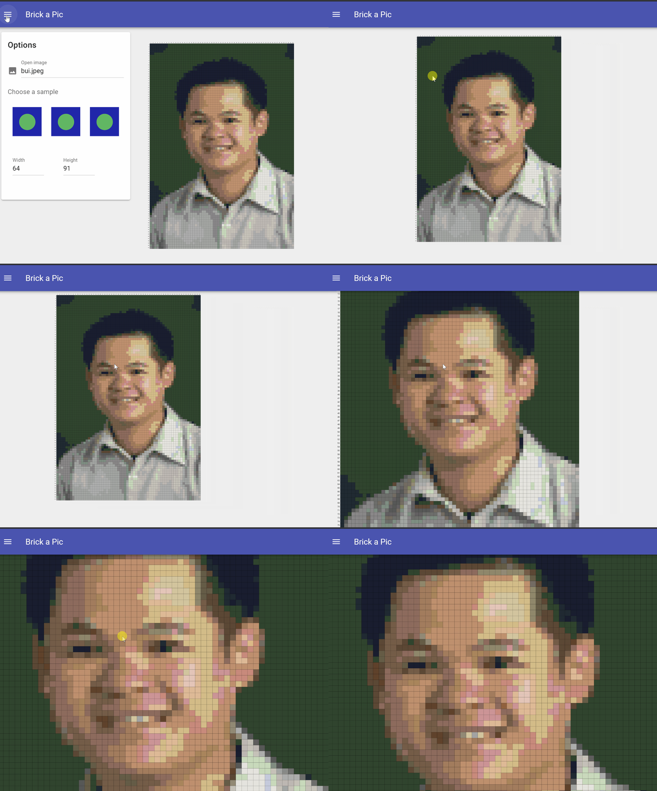
It’s possible to upload any of your own images, and they will automatically be converted to a pixelated mosaic:
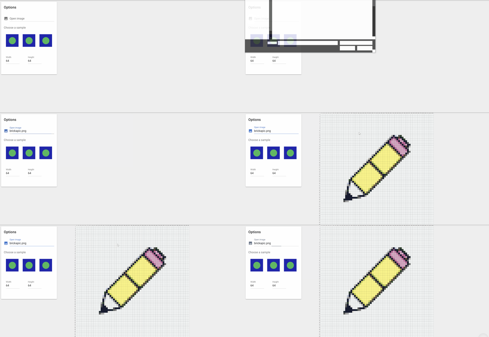
Or, you can pick from a sample image (more coming soon):
Pan/Zoom Functionality
Once you’ve uploaded an image, it can be panned and zoomed across the screen at will. It’s fully touch-screen compatible, too!
Color Palette Selection
Since not everyone has the full LEGO color palette to use, there is now a ‘color picker’ that allows you to pick and choose which LEGO colors will be applied to your mosaic:
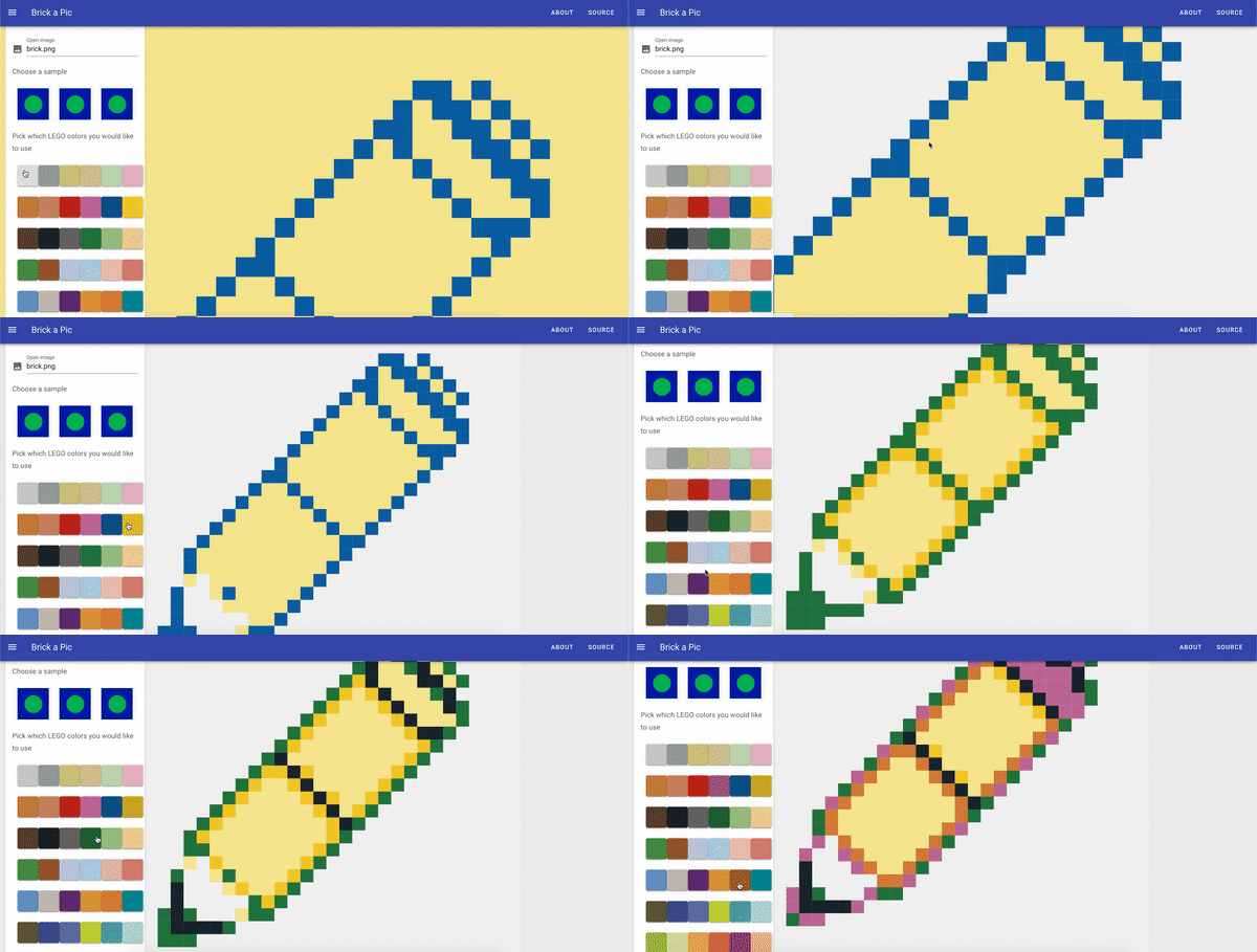
Image Transformation
LEGO Color Approximation
Each image is transformed by downsizing it to a smaller size, then calculating the Euclidean distance (in terms of red, green, and blue values) of each remaining pixel and picking the closest LEGO color:
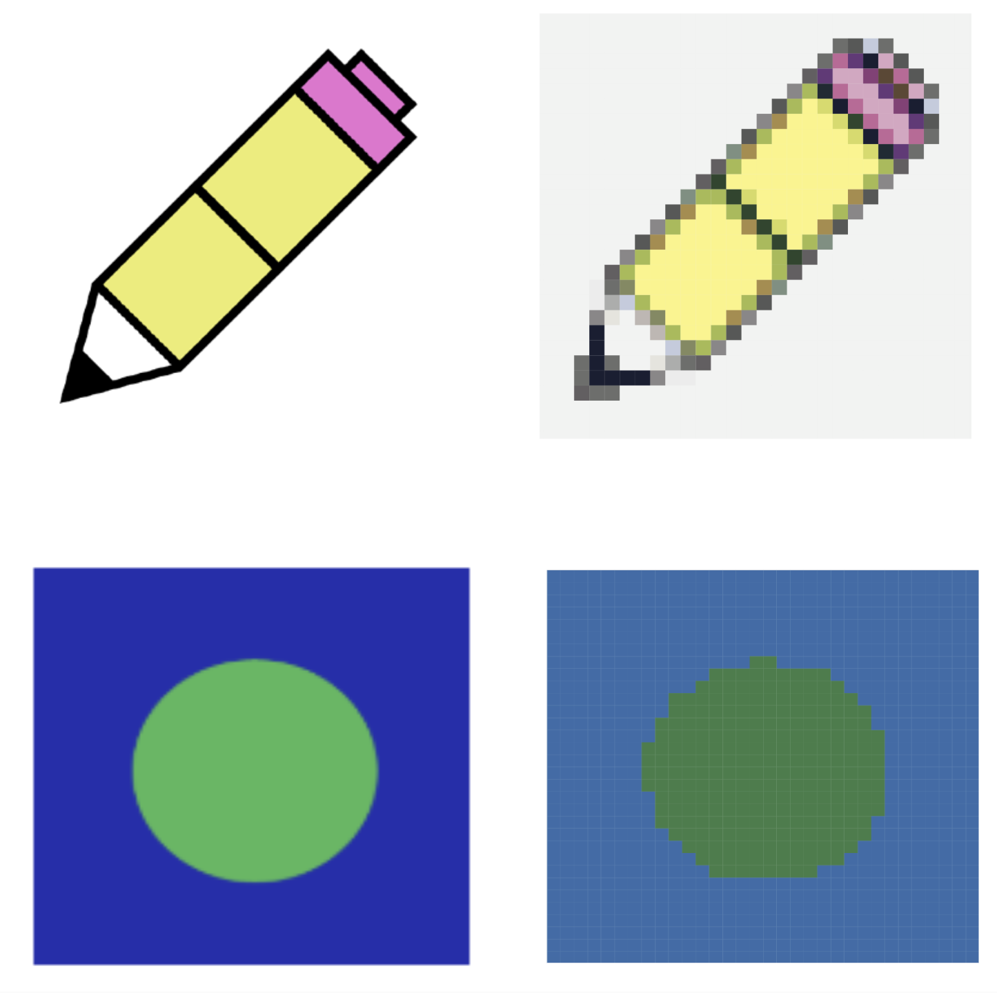
Image Size Detection / Scaling
The app will also automatically detect the relative shape of an image, and size the mosaic to match:
Next Steps
We’d like to focus on developing a few things in the near future:
- Better input validation, since the form does not perform very much and it’s possible to enter invalid values
- Expand our documentation, so it’s easier for others to contribute. There’s not much in the way of our README and CONTRIBUTING at the moment.
- More mosaic customization options, since it’s the heart of our app.